They only want to hear the hits
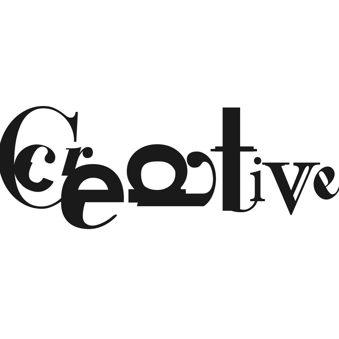
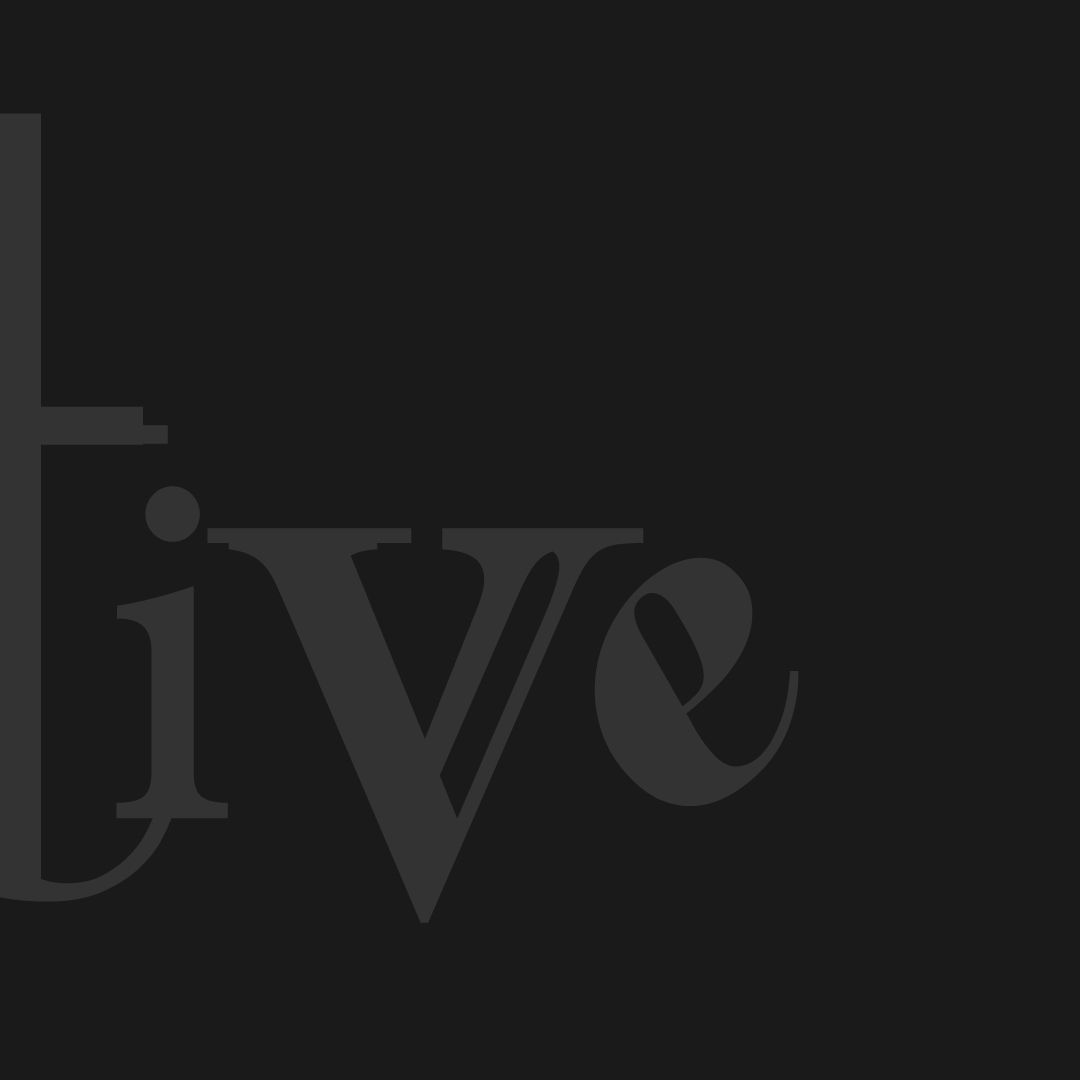
This is a crop of an actual design I actually proofed with an actual client (modified for privacy, of course)
It's wacko—I know, I designed it. Should the client have selected it? Probably not (spoiler, they didn't). But, before we get into a debate over readability vs legibility (because you're wrong), or over design brief vs personal aesthetic, I'd like to explain a bit more about the process. I'd like to lay out why a seemingly out-of-place design like this even exists, and the valuable role it plays in the identity discovery process.
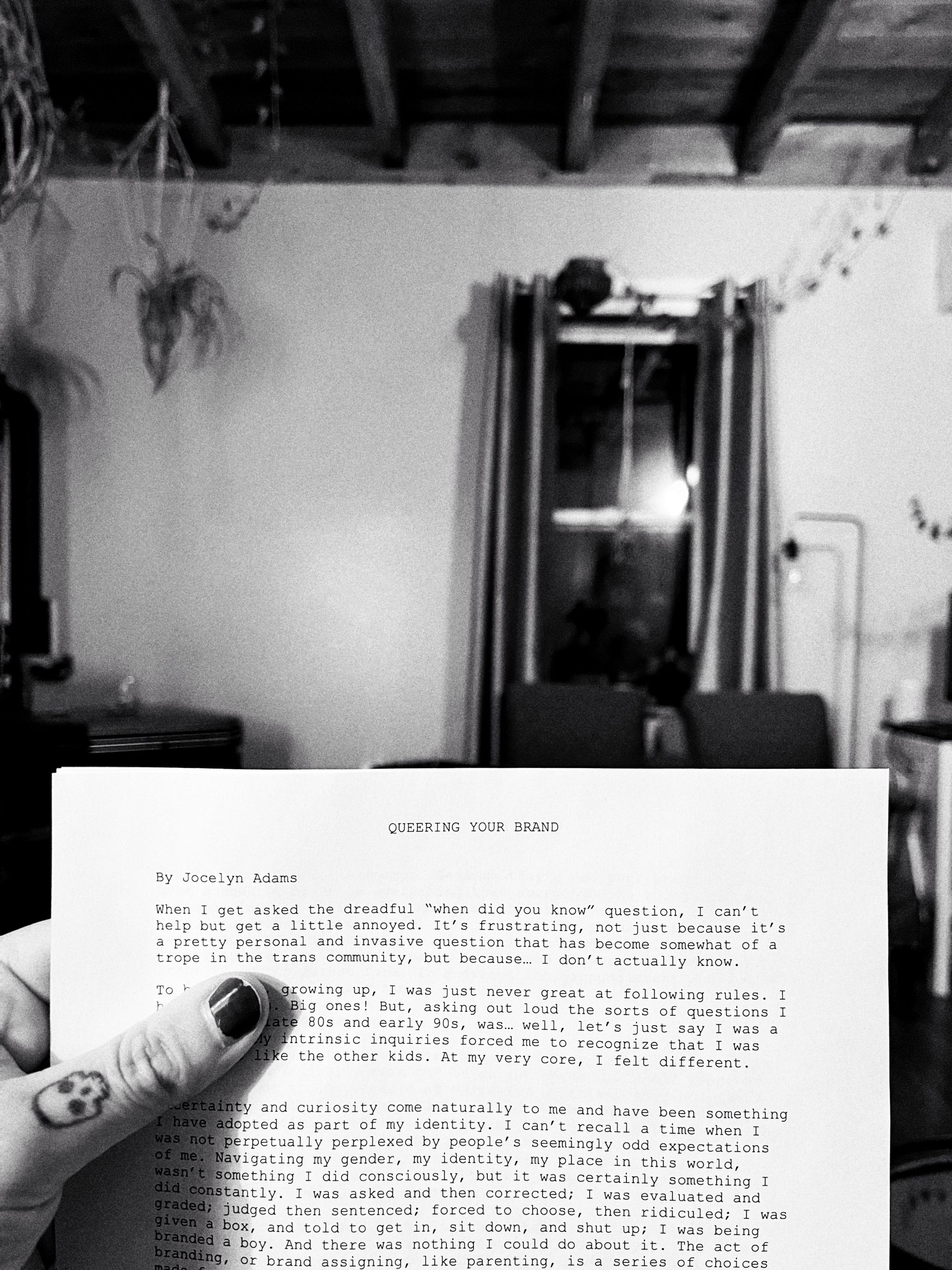
When I’m commissioned for identity work, generally, after a ridiculous amount of research (you have no idea), market analysis, and thoughtful personal considerations (equally important to identity discovery, see Queering Your Brand), I will present a client with 2-4 completed designs for consideration. This is pretty standard at most agencies. The number of designs could also depend on the brief, budget, availability of suitable concepts, amount of coffee that day, and, frankly, whether that client is an asshole or not. But, I want to avoid ragging on clients from hell. Sure, they're out there, but they're nothing special, honestly. And, that's certainly not what this essay is about.
They only want to hear the hits.
A mentor and dear friend of mine, Alex, once told me years ago—and I never forgot it—after discussing the prospects of business versus creativity, that, like popular music, most people only want to hear the hits. That phrase has been ringing in my ears for two decades, and proves itself true, time and time again.
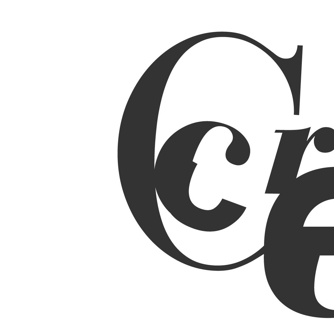
When I create a spread of design options, the degree to which the designs contrast against themselves varies. There will always be a spectrum of options: conservative to chaotic; boring to bold; wild and fun to hipster and clever. That gamut itself has a threshold that depends on a client's personal (and sometimes branded) window of tolerance. Occasionally, the options are merely a narrower view of one smaller area of the spectrum: clever to clever with a side of colour, or fun to slightly quirky. After a few consultations, I’m a pretty good judge of how much creative risk I think a client can tolerate. Sometimes none, and other times quite a lot, actually. But, unsurprisingly, most tend to side with Goldilocks, choosing what's safely mediocre—the easy pop hit. Is that wrong? Nope, not really. It's predictable. I'd just caution you about the bears.
There’s always a design option included that isn’t necessarily designed to be picked.
But, that doesn't mean it has to suck. Do I design a throwaway option? Would I admit to it if I did? I can honestly say, that yes, I have in the past, sure; but, I've long since found a much more gratifying way to do this that doesn't involve doing lacklustre work.

Take bigger risks. Get seriously creative.
Grab that design brief with both hands and stretch the damn thing until the tension is so high it feels as if it might snap at any moment. This is the limit; the extremities; the fullest possible potential; the greatest what if; and, where some of the best work can be found. Not the worst. This is where you strike gold, or die trying.
Does everything have to be a hit—an explosive radio-friendly pop sensation? Does every logo? For those of us who love to reach beyond the "sell sell sell" of capitalist design, and scratch a little deeper into the human (read, psychological) process, it can be a challenge. To create a piece we're proud of, after hours of research, thoughtfulness, educated considerations, and artistic energy—to end up not even showing it to a client because we know (because we're a fucking professional) that it's not a hit. Why? It looks great, it fits the brief (sort of), it's creative, it has passion, and substance—it connects on an emotional level. It's just not pop.
I want clients to pick the riskier option. Safe means boredom, and boredom means death.
It's a vibe, for sure. And, for it, I can thank another major influence on my work (the featured graphic should have been a dead giveaway), David Carson. I'll have to paraphrase, but it was something David said in an online class I took that resonated with me. That was, simply, how is a client going to approve a design, if you don't show it to them?
Story time. Years ago, I was speaking with an art director/designer, whom I really looked up to early in my career. They critiqued some of my portfolio that had an overt Carson influence (hey, I was fresh out of design school—it's essentially a rite of passage). They informed me that Carson was irrelevant to graphic design; he made graphic art. At first, and for many years afterwards, I adamantly disagreed with this. But, they were right in a way…because Carson didn't play the hits. And, that's what was expected in capitalist design. Carson played to the click of his own track (or, arguably, to no click track). That didn't make him less of a designer. Not in the least. But, it did make him a risk-taker, and a hell of a lot more interesting than most designers I know—including that ding-dong art director who said art was irrelevant to design. The incompetence. I wrote in greater detail about the difference between art and design already, so I won't get into it here, but I'd suggest that Carson's work is both—unapologetically.
So simple. How is a client going to approve a design, if you don't show it to them?
Fuck yeah, David. If we don't show clients some of our greatest work because we feel it's not worthy of being a hit, then it's never going to be—stop making that choice. At least give the client the opportunity to take that risk because it's theirs to take. Risk is simultaneously met with both failure and reward. That is a considerable factor in how designers get branding wrong. By designing with so much laser focus, they forget to allow room for ideas to breathe and develop naturally.
As designers, we spend so much energy trying to come to conclusions on what is right, or best, for a client, instead of doing what we originally set out to do at the beginning of this silly career. To create. Don't get me wrong, we're excellent at evaluating risk where needed (revisit the first few paragraphs of this article), but when we make a habit out of removing all risk for the client, we're removing x-factors. Serendipity. Magic. We're also straining away a lot of our original passion, and personal motivation that got us into art and design in the first place.
The design piece featured above was, of course, modified out of respect for the client, but was it a filler design? Absolutely not. Did it fit the brief? Mostly, kind of. Did I think they were going to find a hit on their hands? Not really. It would have been a risky choice, a hard sell to the pop crowd, but it was a choice I let them take by even entertaining this piece. Would I have been proud of them if they chose it? Absolutely. But, they can't approve what they can't see—even if they do only want to hear the hits.

